
Style guide
Every shared component of the Keres website and platform, on a single page. If something looks off here, it is off everywhere. Source: design-system/src — tokens in tokens.css, Tailwind names in tailwind.preset.js.
Colours
Semantic tokens only. Use the Tailwind name (bg-surface, text-muted, border-line); never a raw hex in a component.
Surfaces & lines
canvas
#0d110f · page
sunken
#131815 · panels
inactive
#161b18 · idle
surface
#181e1b · cards
surface-hover
#242c28
brand
#3e3824 · fills
line
#705c32 · borders
edge
#2c3631 · hairlines
Text & brand
fg
#f6f3ec · body
soft
#e2cd98 · strong
muted
#a3a3a3 · meta
subtle
#777 · hints
primary
#cda342 · gold accent
primary-hover
#ddb75e
primary-hi
#eed082 · lit edge
primary-lo
#8c681e · shaded edge
secondary
#187a7e · teal
secondary-hover
#229496
ink
#161208 · on bright
Feedback
success
#48c78e
danger
#c62836
danger-text
#f5848f · on dark
warning
#f0a030
info
#3e8ed0
Board
tile-dark
tile-light
tile-stroke
piece-light
piece-dark
Typography
Three families: Carolingia (font-display: the logo only, always uppercase), RomanSerif (font-title: headings, big numbers) and Source Serif 4 (font-body: body and UI, a serif tuned for screen reading).
h1 · hero / landing title (bare element)
Keres
.page-title + .page-subtitle · page heading in the platform
Lobby
Find an opponent or invite a friend.
h2 → h5 · RomanSerif (bare elements, used in content)
Heading 2
Heading 3
Heading 4
Heading 5
.card__title · .eyebrow · .stat__value
Card title
Eyebrow label1 842
Body, links, emphasis
Body copy in the cream fg colour with a link, some strong text, small text and muted meta text. Lorem ipsum dolor sit amet, consectetur adipiscing elit, sed do eiusmod tempor incididunt ut labore.
- List item one
- List item two
.intro — centred italic lead used on the rules page.
Shape & elevation
Buttons
Bevelled corners, gold lit edges (light top/left, shade bottom/right); the default look is gold border + icon on a dark fill with white text, .btn--primary / .btn--secondary are filled with a dark icon. Default width is wide (--k-btn-min). .btn + one variant; add .btn--sm / .btn--lg for size. Replaces Bulma .button.is-rounded.is-*.
Variants
Sizes
With icon · icon only · links
States
Stacked preset buttons (lobby) — aria-pressed drives the selected look, no class toggling
Joined group · full width · modal close
Labels wrap by default (here in a 16rem box); btn--nowrap keeps one line
Forms
The Symfony form theme maps onto these classes (form_row → .field, form_label → .label, form_errors → .help--danger).
Shown on your profile and in games.
This value is not a valid email address.
Composition · lobby “new seek” form
New game
Pick a preset or tune the time control below.
Cards & stats
Card
Default surface for grouped content (Bulma .box).
Interactive card
Border lights up on hover.
Statistics
Wins
128
Losses
94
Draws
12
Win rate 54.7% over 234 finished games

Magnus Online
@magnus · Member since March 2026
Tags
Solid
Soft (tinted)
Sizes · square
Alerts, callouts & modals
Callouts (rules page)
Modal
Game over
You won by checkmate
Resign this game?
You will lose the game immediately. This cannot be undone.
Move the whole stack?
This tile holds a stack. Choose what to move.
Send feedback
Empty state · spinner
You have no games in progress.
Navbar
Sticky in the app (static here so several can be shown). Resize below 1024px to see the burger menu. The notification panel is shown open.
Signed out
Signed in, notification panel open
Tabs, menu & pagination
Tabs
Pill tabs
Side menu (settings / admin)
Collapsible side menu (collapsed below 1024px behind a toggle; the app script toggles .is-open)
Pagination — datagrid
Pagination — simple (page X of Y)
Language switcher
EnglishFrançaisTables & lists
Table (hover) in a card, scrolls horizontally on small screens
Open seeks (4)
| Player | Time control | Mode | Colour | |
|---|---|---|---|---|
| Ada (1612) | 3+2 | Rated | Random | |
| Linus (1540) | 10+5 | Casual | White | |
| You | 1+0 | Rated | Random | |
| Grace | 24h | Rated | Black | Unavailable |
Admin datagrid: toolbar, status tags, actions
Game rows · friends · announcements · notifications
Friends
- Ada @adaOnline
- Linus @linusRequest sent
- No pending requests.
Announcements
Tournament weekend
Join the first bot tournament on Saturday.
New board theme
Settings → Board lets you toggle coordinates and threats.
Show 2 moreShow less
Welcome
The platform is now open.
Notifications page
Game screen
The full game page (player cards, board, moves panel, three container-query layouts, fullscreen) has its own page with a viewport simulator: open the Game view lab →. Below, its building blocks in isolation.
Player card (slim row layout; becomes a tall column card ≥ 94rem)
Clock states
Status banner (one state at a time)
Evaluation bar (white ahead · black ahead · flipped · pending)
Icon buttons, game buttons, switches
Moves list + navigation
Moves
- 1.
- 2.
Option badges · feedback banner
Pieces & rules
Piece icons (CSS mask, 3 tints)
Piece cards (rules page)
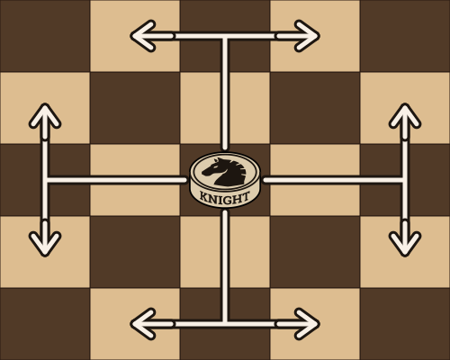
Moves in an L shape.
Can jump over pieces.
Any distance orthogonally.
Movement table
| 1 | 1 | |||
| 1 | 1 | |||
| N | ||||
| 1 | 1 | |||
| 1 | 1 |
Hero & sections
Keres
A new abstract strategy game of stacking and tactics.
Play nowThe concept
Two armies, one board, and pieces that can carry each other. Stack, unstack and outmanoeuvre your opponent.
Read the rules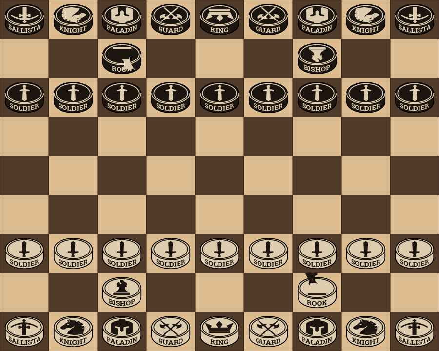
Collector's edition
Lightbox: click the board image above to open it.
Prose (legal pages, Markdown)
Privacy policy
We collect the minimum data necessary to run the service. Contact us for any GDPR request.
- Account data
- Game history
Your games belong to you.
Error page
Footer
Admin tools
Board editor palette (board-editor__*, admin.css) and the opening tree (tree). The board column board-editor__board is sticky and sized from the viewport height by the platform.
Pieces
White
Black
Opening tree
- H1 → G3 (99) -0.2
- H9 → G7 (38) +1.5
- B1 → C3 (10) …
- No recorded continuations.
- H9 → G7 (38) +1.5
- F7 → G6 (6) +1.9
Tutorial
The platform's /tutorial (tutorial.css): tutorial-slide (an exported board image and its caption, one at a time), tutorial-progress, then tutorial-board (the live board of the guided problem, sized like the board editor's) with its tutorial-caption and tutorial-message.
3 / 7
Page layouts
Realistic compositions to check that everything sits together. Layout uses plain Tailwind grid utilities; Bulma's columns / level have no equivalent component.
Settings (menu + form)
Profile
Visible to other players.
Login
Dashboard
Lobby (new seek, open seeks)
New seek
A format fills in the form below. Adjust anything, then post your seek.
Open seeks (2 waiting)
| Player | Time control | Rated | Colour | |
|---|---|---|---|---|
| Ada (1612) | 3+2 | Rated | Random | |
| You | 10+5 | Casual | White |
Settings (board & gameplay, blocked users)
Board & gameplay
How the board opens in your games.
Piece movement
How fast pieces slide to their square.
Blocked users
Admin datagrid (filters, toolbar, pager, table)
| # | Players | Result | Rated |
|---|---|---|---|
| 325 | WEngine L1 vs Bada | 1-0 | Rated |
Admin dashboard
Total players
1 248
Connected (5 min)
37
Finished games
9 402
Stale games (24h+)
5